
Tree Service & Forestry Operations Company to Vancouver Island and the Mainland
Jennie and Dave asked for a website that looked professional, approachable and up to date while still conveying the gentle beauty that is Vancouver Island. Being the Professional here, I suggested a nice gold “wedding font” with neon background colours…I WAS KIDDING! But it made them laugh!
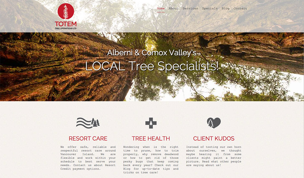
The logo speaks to the subject of their business in a simple yet recognizable way. The focus is put on the tree and the first word of their company name with shape, size and the colour red. This makes it noticeable in whatever format it is utilized (IE: trucks, signage, business cards) and because of this, they are now simply known as “TOTEM” to their customers.
![]()
Web Design and Development: Michelle | emenem design